Interactions with Intersections
9/2/2020, 4:30 pm, rainy and humid
Who would have thought that the five-minute walk from my dorm to the Forbes-Beeler Intersection was the furthest I had ventured in the past two weeks (besides traveling from Mumbai to Pittsburgh). The first thing I noticed as I walked up to the intersection was that the east campus parking lot was under construction. To cover the scaffolding, CMU had put up a colorful poster running along Forbes, which seemed to set the tone for the people I saw on the streets. I sat on the grass nearby and observed as students crossed the intersection. Some were cycling or skateboarding, others were running or walking, a few with packages of food in their hands. Some waited at the bus-stop which was also situated at the intersection. They all seemed to be doing going somewhere important and I felt I stood out as the lone student sitting on the grass taking pictures of a regular intersection.


There seemed to be a lot of cars on this intersection, a few passed me with blaring music which made me flinch, while others rolled by silently. The buses also made a lot of noise when they passed though I noticed they were often empty inside.

As I tried to photograph the different perspectives of the intersection I felt the footpaths were crowded and unwelcoming. As there was construction, the Forbes footpath was extremely narrow and I often had to wait for people to pass me to get a place to stand. I could see far to the end of Forbes Avenue along with the University of Pittsburgh Cathedral which gave me a sense of the city outside of CMU. The close proximity to my dorm made me feel safe while still exploring a new part of campus that I hadn't seen.
9/6/2020, 9:15 am, windy and sunny
Visiting the intersection once again I photographed it keeping in mind the feedback and advice we got in our last class. As I was taking them I got increasingly uninterested with it. It seemed like I hadn't ventured out enough and actually found an intersection I thought had character. It was also earlier in the morning so not much was happening except groups of older women brisk walking past me every few minutes. Blessed with perfect weather, I decided to venture out further down on Forbes.

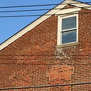
The minute I hit the South Craig and Forbes Intersection, I felt compelled to photograph it. I was immediately drawn to the colors of the buildings — brown contrasting with the soft grey. There were no modern structures on the intersection and it didn't feel overpowered by one particular building, they all seemed to exist together in harmony and complement each other. Two cathedrals peaked through in the background and the dark industrial lamps seemed to complete the intersection perfectly. There were people around but not too many and cars passed by silently. The footpaths were wide, it had bike tracks running throughout the street and there was no litter or garbage on the side of the road.
I wrote down some words that I felt best described the intersection:
Inclusive, urban, old-fashioned, quaint, and welcoming
I truly felt I could sit there the whole day and watch cars and people go by. However, I don’t think I would have appreciated this intersection had I not visited Beeler first.
9/10/2020
Relief 1
Notes on making my first relief:
- Using a bone folder is a quick way to make impressions on the card stock but does not capture detail effectively
- a 45-degree angle between the paper and the cutter makes the cleanest cut with the least effort
- Other ways to get the shape on cardstock — try getting carbon/transfer paper or print the photograph multiple times and use the cutouts as a template
- When layering, cut out each background shape till the end of the picture so the foreground pops out more
- To make windows — you don’t have to stick the paper on top but rather make cutouts in the building itself
- The detail on the furthest building — use the bone folder just on top of the
- For curves, don't cut through the entire paper the first time
- Double stick tape might be better and neater instead of using glue!
- Glue transfer method: use a small piece of paper with glue on it to put glue on the corners of shapes that are sticking out
- When photographing the piece — change around the light source to get the shadows to show or move the composition


I liked that:
- It captured the calmness of the intersection along with the layers of buildings
I didn’t like that:
- It was too simplistic. There were some really interesting parts of the building structure that I missed out adding, along with a lamp that I also should have included. It feels incomplete to me.
I definitely want to add more detail next time without overcrowding the intersection.
Relief 2
After receiving the feedback from my previous work, I understood I needed to add more detail to better communicate the intersection. I went back to the drawing board and re-sketched out some of the details on transparent paper.
I discovered an effective method of tracing: by placing my laptop “screen-down” on a table, I was able to use it as a lightbox and could see the detail and edges of the shaped much more clearly.

Once traced, I would then go cut through the tracing paper and score the paper below.


I changed the framing a bit from my previous one so it better focused on the buildings and architecture that I thought was so unique. I’m glad I redid this composition before my grayscale ones as I feel much better equipped with using the blades and carving out tiny details.

9/11/2020
Grayscale 1
I decided on my values based on the fact that my composition had a great depth to it. I wanted to enhance the atmospheric depth and show the perspective using the gray tonal values — black for objects closest to you and lighter shades as objects move away. I thought this would better encapsulate my intersection rather than using the gray as tonal values for colors.
Before I had stuck down the white relief, I had traced out the pieces on another paper thereby creating “templates” for my grayscale composition. I found I could use these templates to quickly sketch out the basic shapes and then only use tracing paper to add detail and refine the shapes.


I found my paper cutting abilities had improved once more and I found myself confident with the tools I was using. I found that the x-acto knife worked better to score details but required the blade to be changed frequently. I decided the best method was to switch between the x-acto and olfa blade depending on how detailed I required the cut to be.
9/15/2020
Color 1
From the moment we got the prompt to add color to our composition I knew I wanted to use a blue that represented the sky. Going back to my entries, I realized what a big impact the weather had on how I viewed the intersection and my mood and enthusiasm surrounding it. I thought the bright blue sky perfectly complimented the architecture and captured the essence or at least how I felt about the intersection. However, I thought if I made the sky completely blue it would overpower the intersection. I hence decided on doing a combination of the windows and cathedral.
Using photoshop, I created different options on how to bring out the blue in different areas. I didn't like the blue sky as I thought it was stating the obvious. In the end I decided on the third option as it was a good balance between the two.


I learned a lot from crafting this composition, mainly about how to emphasize certain moods using colour. I’m thinking of not making the windows blue at all and maybe an even more simplistic approach would convey the feeling of the intersection better.
9/21/2020
Refinement: Grayscale 2, Color 2
I realized I wanted to redo my grayscale and color one as the tonal values I used were quite different. I also added further detail to the buildings which I thought didn’t add anything to the intersection, but rather drew the viewers eye away from the depth which I wanted to emphasize.


To better unify these two compositions, I decided to cut the shapes out simultaneously. In doing this, I would restore a uniformity between my compositions and ensure that the only aspect I changed was the color.

Final Takeaway
In doing this project I learned important skills in communication and how to convey your story through the use of minimal shapes and selected details. I learned about how the addition or subtraction of the object can change the dynamic of a composition completely and how color plays a role in communicating emotion. I definitely improved my craftmanship and can see a huge difference in my skill level in the first composition and the last. Though the process was tedious at times and required trial and error, I most enjoyed the part of figuring out how to best translate the image on paper. Creating “templates” and using them for the cutouts made me realize how creativity could quicken a process and thinking outside the box and exploring can only be beneficial to the final outcome.